Down Keyboard, Up Brush

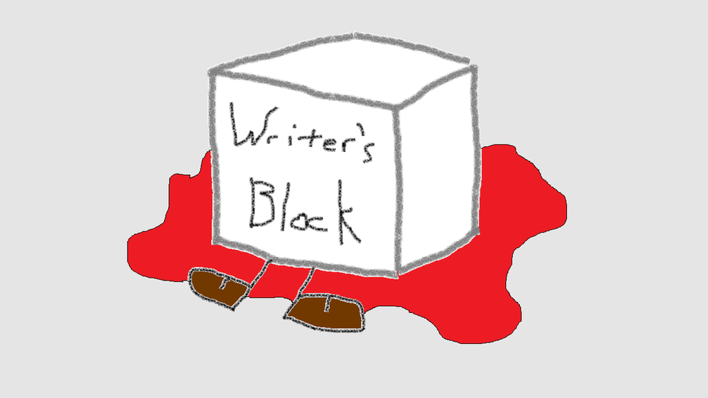
I am not keeping up with the blog recently. Apologies. Realistically, I’ve gone dark for longer before. That whole 5 months I lived in Seattle between Japan and Korea I wrote maybe one post, but I also didn’t have much to write about back then. Now I have 33 drafts sitting waiting for me to work on them, and yet when I open them I just sigh. I did not do a good job taking notes on my summer holidays. I don’t have 4 hours of  enforced desk warming at work every day anymore. I have these lovely three day weekends and I can’t bring myself to spend even one of them writing in here. Nanowri-no-mo. The writers block is strong.

Writer's Block by Pyre-Vulpimorph

I’ve been working on my winter travel plans, which involves reading a lot of other people’s travel blogs. I see a lot of blogs that will do an entire 10-12 day trip in a single post of no more than 2,500 words. It is a great way to summarize a trip and pass on the most vital information to future travelers, so I’m not dissing those folks at all. In many ways I envy them, because my task would no doubt be easier were I to adopt a similar approach. I might even have more fans since “in depth” reading requires an attention span that is not popular in the world of click and scroll. Which, I’m also not dissing. I love scrolling thru my FB feed as much as the next person. However, when it comes to my own content, I want to be able to tell a story. I like telling stories.

It does not help that this semester’s schedule has been a little extra brain taxing, leaving me with less mental spoon-power at the end of each teaching day to sit down and organize a blog post. Three more weeks! I’m staying at this job, don’t worry. I worked way to hard to get it to leave, but I am looking forward to having a chance to get a new schedule for spring semester.

Art History

The good news (for me anyway) is that I haven’t merely crawled into a cave to binge watch Netflix (although I have done some of that as well… like maybe the entire Star Trek catalogue except for Enterprise causethatonesucksfiteme). I have finally reopened my artistic cabinet. Before moving to Saudi Arabia (and thus before starting this blog) I went through a few art binges in my life. In high school and undergrad I was massively prolific. Reams and reams of sketch pads filled, art given as gifts to everyone I knew, and even occasionally sold to strangers for profit!

0013.jpg


Then I stopped. For years.

After finishing my MA and getting back from China, I finally picked up the brush again. It helped that I had some peers to do art with. Going over to a friend’s house to paint and drink tea (or wine) is a lot of fun, and it took the pressure off me to PRODUCE. I finished paintings that had been half done for years. I started new ones. I updated older artwork from my high school days to reflect my new style. I was feeling it.

Then I moved, and all the art went into storage. Saudi was… well, you can read the blogs, but I did my last real piece of art there when I made the life size paper Christmas tree to adorn my hotel room. I made every piece of that from paper and foam because Christmas decorations are forbidden in Saudi. That was in 2014. Since then I’ve had art supplies laying around. At least a sketch pad and pencil. People who knew I liked to make art would give me things as gifts and slowly I accrued watercolors, acrylics, brushes and canvas and they just sat on a shelf.20141206_183852


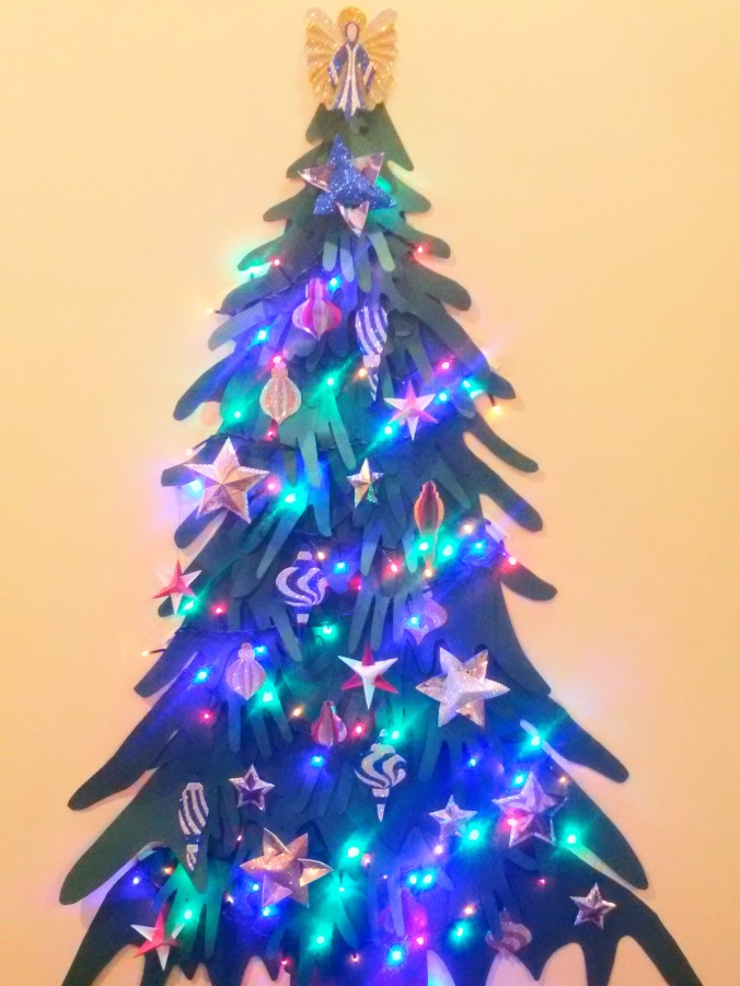
Returning from Europe this August, all my Korea friends were finally gone. Those who didn’t leave in February (the end of the school year) left over the summer. I knew I had to make myself get out and be social in order to avoid the cave-dwelling-Netflix-binge fate. Public “foreigner” events are the best way to go since we all show up expecting to mix and mingle, but I live over an hour away from the two nearest cities with decent expat populations and I knew I needed more than just “socialize” as a motive to travel so far. So I joined some art classes.

clone tag: 2275714863150458950

Specifically, watercolor. These are much more social than educational, but I did end up learning some new techniques as well as just getting a chance to chat with people. The first one I went to in Busan and everyone pretty much split as soon as it was over. The second one was in Daegu where I ended up spending several hours after the class hanging out and chatting. So far, no lasting friendships have been formed, but I had a good time regardless.

Art Spark

I also triggered my art spark. During the last couple of months I’ve delved much more into making art than into doing photography or writing. As a result, my Instagram and Blog are feeling a little neglected. The first piece I started was a simple mandala pattern on acrylic. I spent about an hour looking at mandalas on Google Image search and then sat down to draw my own. Once the pencil sketch was done, I transferred it over to a canvas by carefully measuring over and over. It’s much easier to make a mandala in a computer where you can just copy and paste for symmetry. I also used a black marker to show the main lines. I basically created an adult coloring book page on a canvas and then started using acrylic paint to “color” it.

I wish I could say I was finished, but it turns out that coloring in acrylic isn’t as fun as coloring with pencils, crayons or markers. I also struggled with color. I repainted part of the outer ring twice, and the middle ring 3 times. I have since taken a digital version into Pixlr and experimented with color schemes for the middle ring. At least now I know what I want to paint there… One day, I might even do it.

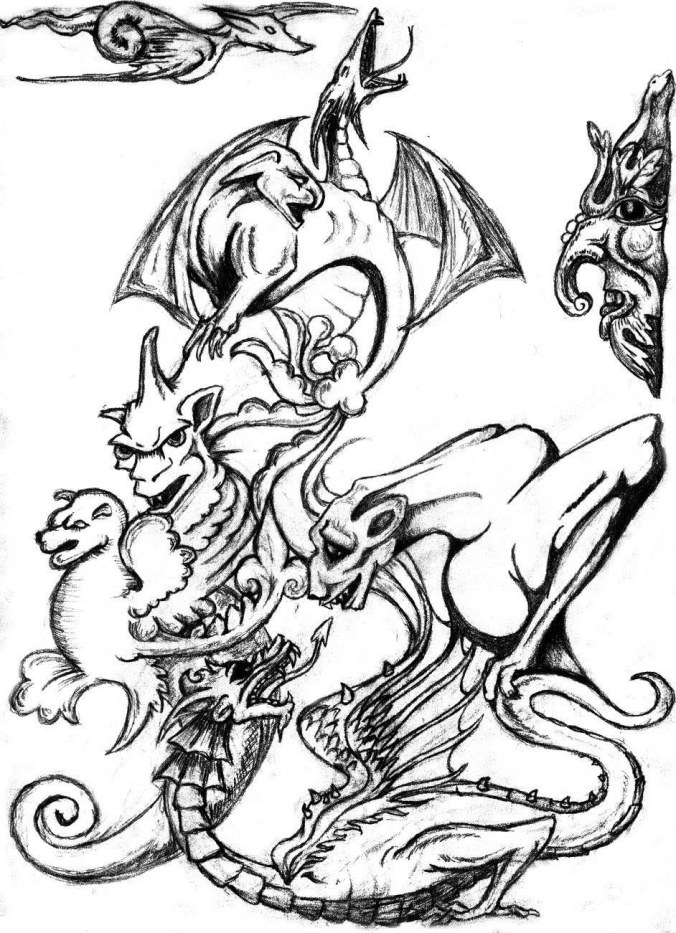
One day when I was tired of meticulously painting inside the lines, I decided to pick up the sketch pad again. I liked the idea of the mandala, of the adult coloring book style, and decided to try to make a mandala animal pattern. Back to Google Image search. I scrolled through a few hundred designs before realizing my favorites were the jellyfish. I have no idea why. Not wanting to copy the poor unattributed artist whose work I was seeing plastered all over cheap t-shirts, Etsy pages and Pinterest boards, I decided to make my own!

I stuck the Star Trek on auto-play and went to work on my sketch-pad. A while later I had the finished design. Most people will recognize it’s extreme similarity to the adult coloring book fad. That is totally on purpose. However, when it came time for me to imagine how to colorize my drawing, I didn’t like the idea of repeating my mandala with acrylic paint experience. Visualizing a few mediums while I lay in bed cradling my chronic insomnia, I hit upon the idea of using colored paper to bring my creation to life!20181105_215322

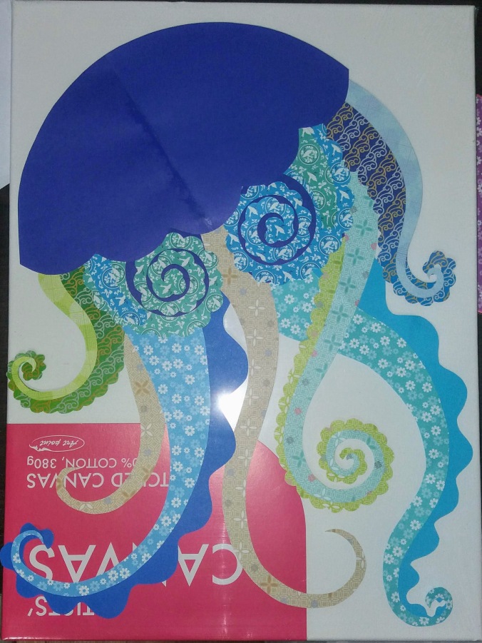
The next day I found a local art store which was overrun with paints and painter supplies as well as the standard Korean “stationary store” supplies like colored pens, and poster board paper. I was never able to find things like wrapping paper, brown paper lunch bags, construction paper, tissue paper or any of the other staple craft supplies I grew up with in America, let alone any of the new craft supplies that my niblings get to play with. Maybe in Seoul there is a shop that has them, but not here. The only patterned and colored paper I could find was for origami. I bought a half a dozen different design packs and a decent sized canvas. There was also no such thing as decoupage glue or mod-podge, so I got plain white glue and made my own by mixing it with water. Old school.

I didn’t want my bright colored jellyfish alone on a white canvas, though. What do do for a background? Paint it blue with acrylics? No… I really wanted a watercolor effect, but I didn’t have confidence in my ability to do it, especially not on a canvas. I decided to make the watercolor on paper and decoupage the background as well as the foreground.

Paper-cut Redux

I cut circles in various sizes, hoping to evoke a “bubble” feeling. I then spent hours (more Trek bingeing) painting them in pale shades of blue and green.

20181111_202236
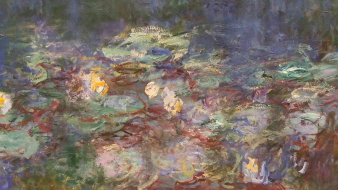
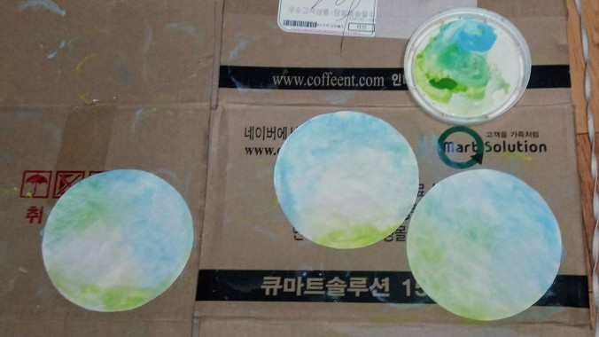
It was worth it. When I finally was ready to create the background, I placed the different sized circles around the canvas. I painted them in layers, mixing a little white paint into my glue/water mix so that the bottom layers would fade a little compared to the top layers and give it some depth. Originally, I thought there would be distinct bubbles against a white background. In the end, the whole canvas was covered and it reminded me of Monet. I tell you, I loved that background so much I almost didn’t want to put anything on it. I will definitely be using that technique again.

For the jelly itself, I started off by cutting the pattern from plain white printer paper (abundant at my office). I used the canvas to make sure the pieces fit and I had to make some changes from the original drawing to accommodate the new size and materials.20181111_202246

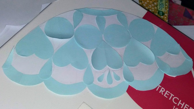
When I had the tentacles and body shape done, I used post-it note paper to measure and cut the patterns on the body. It was much better than plain paper because I could make sure they stayed in place while I added other shapes. I had to change the size of the heart shapes because the first attempt was too small. Being able to stick them to the body let me clearly see how the shapes would look glued down.20181112_161715

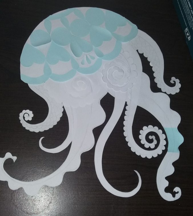
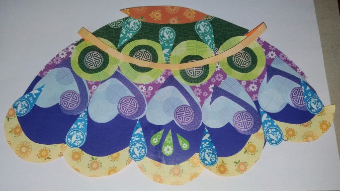
Finally I was ready to cut the colored origami paper. Sort of. First I had to decide which pieces got which colors and patterns. I had a limited amount, no more than two sheets of each type and remember origami paper isn’t exactly big, so for larger chunks, I had to line up the two sheets along their pattern to make it seem, well, seamless. I also had to balance the colors and shapes in my head.

20181119_164501When I made my final color decisions, the last of the cutting was ahead of me. I had to trace the white paper stencils onto the origami paper and faithfully cut each shape and each layer. The tentacles were actually fairly easy, but the accents on the body were the most challenging. Here again the sticky paper came in handy since I could just stick my stencil to the colored paper rather than try to hold it down. I also enjoyed using the designs on the paper like using the pink circles on dark green to make the circle centers, or using those same patterns on the purple to accent the hearts. Not only cutting the shapes I needed, but cutting them around the patterns.

20181119_194723

In the end, the gluing required more patience than I could have imagined! I had to be very gentle with the wet paper. It wasn’t just gluing pieces down, but using the watered down glue like a paper mache. The paper would be wet and tear easily. However, if I didn’t soak the paper evenly, it would pucker and wrinkle badly in response to the areas touched by glue. I added only one or two pieces at a time and had to wait (more Star Trek) for them to dry at least most of the way before applying the next.

20181125_172820

Damp pieces were adjustable, but only a little. If I hadn’t planned and checked everything while it was dry, I don’t think I could have assembled it wet. It was a whole new experience. I’ve done paper mache and decoupage but never to create a 2d art of my own design, and on a canvas no less. It took me 3 weeks of working on it in my spare time.img_20181126_215130_406

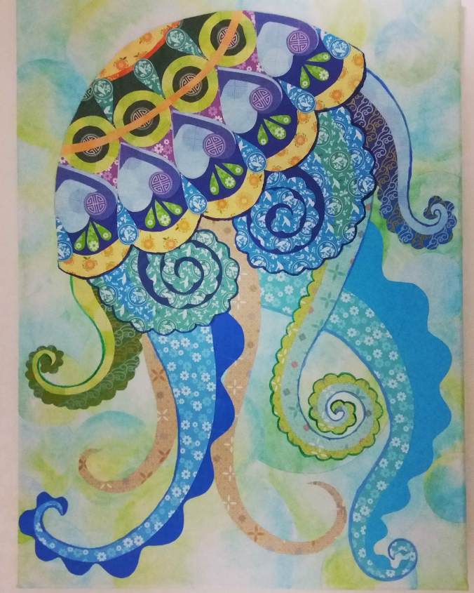
And that’s why I haven’t been writing…

A Day of Art in Paris

It was with deep sadness that I had to forgo the museums on my first trip to Paris. I didn’t know enough about buying advance tickets, and since I only had one day in the city on that trip, I wanted to make the most of it with free and quick events. This time, I put three museums on my must-do list. You’ve already read about the Arts Forains, but my other two museum forays were more typical. Not the Louvre, but the less well known and therefore less crowded Musée d’Orsay and L’Orangerie. I managed to get a discount buying a combo ticket and WOW was it ever worth it!


I was using City Mapper to find my way around Paris and the route from my Airbnb to the museum didn’t involve the nearest metro station, but rather a bus stop across the river. It’s a beautiful walk through the gardens and over the bridge. Although it is not the famous lock bridge, the sides are still lined with padlocks in many colors and street vendors hang out selling more locks as well as balloons and ice cream.

20180706_100258

My first impression on entering the Musée d’Orsay was that even the building was a work of art. The central arena looks like a beautiful baroque train station, and there are many floors and side rooms filled with some of the most amazing art you’ll ever see.

20180706_133407

During my visit, there was a temporary exhibit of Baltic artists. I slid from these rooms into halls and halls of displayed paintings. The main floor is covered in white marble and bronze statues. I saw more Rodin than I ever thought I would and realized that other than his famous sculpture of “The Thinker” and the larger work from which it derives, “The Gates of Hell” (below), I don’t actually care for his work. I also can’t find any reasonable discussion of why he felt the need to use fig leaves this late into the modern art movement.

20180706_132911

I discovered some artists I didn’t even know about like Gustave Moreau who’s painting Galatée (below) completely captivated me.

20180706_105041

Many of the classical artists in the ground floor created stunning details to the point where one could spend a long time finding each hidden treasure. Room sized paintings with dozens of people had near photo realism on each face. Getting up close to these just unfolded more and more details to delight the eye. I got lost in Paul Chenavard’s Divine Tragedy (below) for a long while. It’s 4m high and 5 across (13x16ft more or less) and is chock full of tiny little details and insane imagery. Apparently people hated it when it came out, but I loved it. Reading more about the symbolism just made me love it more.

20180706_111636

I was so entranced by the main floor that I almost forgot the reason I came, to see the impressionists!

My First Impression?

I went on a quest following the signs and found Renoir (not pictured) and Monet (below) then stumbled across the museum restaurant. It wasn’t yet time for a snack, so I paused just long enough to take a photo from the back side of the clock before moving on.

20180706_113053

Finally, I found it. Impressionism and neo-impressionism.  I love impressionism. I knew I thought fondly of Monet, but somehow I forgot how much I really enjoy it. Books and online photos cannot live up to seeing these beautiful works in person.

20180706_150214

Neo-impressionism was a real delight as well.  While the paintings on the first floor captured even the tiniest details in the smallest focus, impressionist paintings just become meaningless blobs of color the closer you get, and it’s only when you step away there is a picture. The picture is made in your mind as a way to make sense of these random dots. Not only do I love the colors and the movement implied by the direction of the bush strokes, but I love the idea that these images only exist in my brain and not in the canvas.

20180706_120632

I took pictures mainly of things that stood out to me at the time or that I want to read more about later. I think I found some new favorite artists too: Georges Seurat, Henri-Edmond Cross (above 2), and Paul Signac (below) were all featured but Signac stole my heart! I actually returned to these paintings for a second look before leaving for the day. I spent a tremendous amount of time with them, changing my perspective by moving closer and farther and side to side. The texture of the paint alone is captivating, but the effect of the whole is pure magic.

20180706_150259

Chat Noir

Still searching for van Gogh I stumbled into a display about the Chat Noir Theater. I am sure you, like I, have seen the Chat Noir poster on t-shirts, hip bags and other products without realizing where it came from. The Cabaret was quite eccentric, filled with art works and strange objects of interest. Musicians like Debussy and Satie would come and play the piano sometimes. The main attraction, however, was the shadow theater.

20180706_121246

Cut out figures made first from cardboard and later from zinc were back-lit to create silhouettes. The host would tell the story as the figures moved on set, often improvising commentary to include current political and social witticisms. The mechanism for the productions became extremely complex over time, and the Cabaret was famous for these elaborate, and above all entertaining shadow plays. The museum tells the whole story of the art form and displays some of the more interesting figures used in the performances.

Vincent at Last

20180706_124406I finally found my way to the van Gogh. I have loved him since I first saw his distinctive style, and came to love him more when I learned we shared a bit of atypical neurology. I planned on going to his museum in Amsterdam, but I couldn’t pass up the chance to see his works in Paris, too.

Seeing the van Gogh up close was amazing. The paintings are roped off, but they are not hidden behind glass and the “stand behind this line” marker is less than a foot from the painting. It’s possible to stand at the edge and see the detail of texture and brush stroke. I felt only slightly bad doing so as everyone wanted to take pictures of the whole painting and being up close put me in the way. The museum rope was much closer that the camera ideal range and so while I tried not to walk in front of anyone about to shoot, I was not about to give up my chance to see the details so people could take photos that look the same as any print. Yes of course I took photos too, but I also took up close detail photos.

I don’t know if other people feel the way about the color blue that Vincent and I do. I can’t get enough of his blue blue skies, most especially when combined with the golden hay of a late summer field. One that particularly struck me was a simple painting of farmer’s napping called “La Meridienne” (below).

20180706_123945

The blue and gold are so stunning that the simplicity of the subject matter is almost irrelevant. I looked it up when I got home and discovered that van Gogh copied it from a pastel work by Jean Francis Millet (below). It’s obvious that it is an homage, but the difference in the style is amazing.

La Méridienne - Jean-François Millet - Museum of Fine Arts,Boston

Van Gogh created it while he was in the asylum. He often copied artists he admired while he was learning to paint (although in the beginning he tried to copy their style as well). While incarcerated he went through another phase of copying, but more frequently by adding his own unique colors and brush style. I think he copied more from Millet than any other artist.

Polychromatic Rainbow

Another seasonal exhibit at the museum was a display on polychromatic statues. While most statues from history have come to us as plain white marble or unadorned bronze castings (this turns out to be wrong, but the perception remains), there was a brief but vibrant period in three dimensional art to include more color. By the 18th and 19th centuries, the high-brow art scholars all considered color in statues to be very low-brow. Imagine how you feel about cheap porcelain dolls mass produced and badly painted being displayed as art? They felt that way about any statue or sculpture that did not maintain monochromatic purity. Of course color in sculpture existed, but it was just crass popular entertainment for the uncultured lower classes.

Then in the 19th century, some artists got the notion to challenge this rigid class system and began to explore the world of polychromatic statues with renewed fervor. The two styles were natural, made by combining natural materials of different colors such as colored stones or differently hued metals, and artificial, made by painting or lacquering the finished product. The results were absolutely amazing. I was possibly more entranced by these rooms than anything else in the museum.

While the painted statues were beautifully executed, I was more interested in the natural style. The amount of effort and planning it must have taken to combine various types of stones, and then blend those with cast metals! Artists had to collaborate to make such works as very few could work the stones and metal with equal skill.

I was struck by the fact that this was also the only place in the museum I encountered African faces. Some incredible works in the polychrome display were of a man from Sudan (not pictured) and a woman from Algeria (above). They were depicted in poses of joy and power with clothing styles that reflected wealth.

Two of my favorite pieces include a miniature of a woman at her embroidery frame which used stained glass as the tapestry she was creating:

And a larger than life statue of a woman that combined a wide range of colored stones including a richly marbled agate to make the pattern of her dress, as well as lapis lazuli and malachite to make her belt.

As the movement of mixed media and 3-D color persisted, it moved away from a mimic of classical and renaissance styles and began to explore symbolism.

20180706_131956

Ceramics became more popular, allowing for colorful glazes. There was even a brief flirtation with incorporating this polychromatic art into building exteriors in the form of architectural ceramics.

Finally, the display drew to a close with the most dramatic end result of the movement by setting Degas’ “Little Dancer Aged Fourteen” and Hans Bellmer’s “The Doll”. Both incorporate materials in an unusual and even extreme way. Degas statue is primarily bronze, but includes real horse hair, a real corset, wax coated ballet shoes, and a cotton skirt. At the time it was considered to be quite the edge of the envelope in terms of modern art.

While the dancer is no longer unsettling to modern viewers, I think “The Doll” will always be creepy. It’s also mixed media: wood, papier mâché, real socks, shoes and hair. Degas was an impressionist, but Bellmer was firmly surrealist, and his disturbingly erotic imagery was an act of defiance against the Nazis in 1931 Berlin when he created this work.

Lunch

After three or four hours of museum, I was both tired and hungry. Art may be a feast for the eyes but it does not fill the stomach. There aren’t a lot of lunch choices near the museum so I decided to go ahead and try the 5th floor restaurant. It is a bit pricey as expected for a tourist attraction eatery, but the food was excellent, living up to the standard of French cuisine I cherish. I had a ricotta and spinach ravioli with Gorgonzola sauce, walnuts and chives. Heavenly. Plus a glass of my favorite French wine: viognier, and a lovely cafe creme for afters. Like most French food, I thought the portion looked small when it arrived, but it turned out to be quite generous and incredibly rich. I think the meal was about 24€, so not bank breaking, but definitely a luxury.

20180706_140059

I got distracted on the way back down from the restaurant, checked in on Signac again as well as discovering a whole set of rooms I missed on my first trip through which had yet more paintings of enormous size as well as some furniture on display for it’s elegant design. I stared rather longingly at the beds on display, and didn’t leave until 3:30 I spent a total of five and half hours in the museum and no more than one hour at the restaurant. I still didn’t see everything on display.

20180706_151519

Lilies at L’Orangierie

The heat wave that gripped Europe during the summer was in full force by the time I stepped outside, and the simple walk from d’Orsay to l’Orangerie was a far more hot and sweaty affair than I would have hoped. Even with the climate control needed to protect the paintings, the museums were struggling to keep up with the combination of extreme summer weather and high season crowds. Nonetheless, it was a pleasant relief to step inside once more.

20180706_154502

L’Orangerie is famous for being the permanent home of Monet’s “Water Lilies”, a series of paintings that I have enjoyed as long as I can remember. It’s one of my mother’s favorites and we’ve had small versions around, or I’ve had replicas pointed out to me whenever we passed one by for my whole life. They are beautiful, but I did not understand the true scale of the work until I stepped into the first of the two viewing rooms that afternoon.

20180706_160236

The Water Lilies are huge! Two giant rooms of huge panels. It’s like drowning in Monet. The panels look a bit like the backdrop for a play in community theater where you just want to suggest a like pond and Willow trees in the moonlight but don’t care about details. I know Monet was making some statements about the nature of realism and symbolism in art, but … it still reminds me of a theater set.20180706_174842

I did the stereotypical museum thing and just sat with the art. In part, I was grateful for a rest after all the walking I’d done that day, but mostly, I just wanted to bask. There is no way photos or even films can capture the feeling of raw art, especially when it’s that big. The rooms were packed with people, some sitting as I was to take in the art, some taking photos and selfies, some just taking a break.

20180706_160347

It’s easy to be judgy when we see people at famous landmarks or museums just sitting on the phone, but I can tell you that it can be overwhelming. Sometimes it’s nice to just narrow your focus back to a screen or a page. I also used my phone to take notes about my experiences and feelings, and to share those feelings with my friends on Facebook or Instagram. I don’t feel like having the phone detracted from my experience at the museum. Sure, I could have used a notebook for notes, a regular camera for photos, and a book to decompress, and a music player, and… you get the idea?

20180706_162529

When the sheer amazing wonder shock started to fade a little, I got up and began to examine the canvases up close. Like all impressionism, the closer you get, the less it looks like anything but blobs of color. It’s still fascinating to me to see the texture and shapes at work and watch the optical illusion as you move from the close to the far and the blobs resolve into the magical dance of light on water and floating flowers.

More than Monet

Although the Water Lilies are the star of the museum, they are not it’s only occupants, and after a good long while, I headed on to the other rooms where I encountered a plethora of abstract art. I respect art, even the art I don’t understand because I think it’s all part of the process of learning and exploring what it means to be a sentient, self aware being in an infinite universe. I don’t like abstract art.

undefined

Abstract impressionism is no exception. I love impressionism and neo-impressionism and just hours before I had that love reaffirmed in the d’Orsay. L’Orangerie hosted the next stage of abstract impressionism. While impressionism seeks to deconstruct the notion of reality by using color and shapes to suggest forms, abstraction casts aside all pretense of shapes or images in favor of “feelings”. It just does not speak to me. Impressionism is an illusion. It looks like a familiar or real image, but is actually nothing. Abstract… is actually nothing and looks like nothing. I can stare at a Mark Rothko (above) or a Jackson Pollock (below) all day and not “feel” anything, but one glance at Paul Signac will steal my heart.

Related image

The good news is, this was a temporary exhibition at the museum, and it’s already gone. The non-Monet portion of the building changes. I lucked out at d’Orsay with a temporary exhibition I found enchanting, so I can’t be too upset the summer show at l’Orangerie was not to my taste. I did look around and read several of the informative panels, and I found one of the rare women artists of the time was featured, Helen Frankenthaler (below). I read about how influential she was on the art movement and wanted so much to like her work, but abstract expressionism still makes no sense to me… even knowing that’s kind of the point.

Image result for Helen Frankenthaler

Closing Up

I was trying to time my departure to get a few minutes in the Monet rooms right before closing time, hoping to get a few wide shots that weren’t full of sweaty tourists, but I discovered that they take closing time very very seriously. A good 15 minutes before the end of business, the museum security started shooing everyone out of the rooms, and would not let me into the second Monet room at all! I could have easily taken photos and been out in 5, but I was barred from entering. I am glad that I spent a goodly amount of time in each room before I went to the abstract exhibit, or I would have been very sad indeed. As it was, I only missed out on photo ops and I’ve already noted photos cannot do it justice. Be warned, however, the museum starts booting people out 15 minutes before “closing” so if you haven’t seen it all, or like me you want that last photo, get in a little earlier than you think is necessary.

20180706_174746

The Best Hot Chocolate

Angelina’s isn’t a museum, but they are artists. Chocolate artists. I wasn’t sure about the idea of drinking hot chocolate in the summer, but I read so much about this little cafe, and it was close to the museum, so I decided to stop in on my way out to the metro. I had a hard time deciding because the reviews for everything were so good, but in the end, my chocoholic side won out. It was so entirely worth it. Probably the most expensive hot cocoa I’ve ever had, but it was rich, thick, delicious, choco-gasm inducing and very generous. I could have shared this pot with another person. I could not have had a whole pot and any kind of dessert without exploding.

No mere “cocoa”, this beverage is mostly melted chocolate with milk and cream and more whipped cream on the side, you know, in case it isn’t creamy enough. It pours more like syrup than milk. I sat in the shade and welcome air conditioning sipping my chocolate bliss, mixing cup after cup with various amounts of cream for effect. Despite the fact that I hadn’t eaten since lunch, I left Angelina’s full and happy.


The weather in Korea is turning cool. It’s even gotten below freezing a few nights this week! It’s almost hard to remember hating the hot weather so much when I’m curling up with my heated mattress pad and fluffy blankie. The hot chocolate here isn’t a patch on Angelina’s but my memories will keep me warm. I hope you enjoyed this foray into the art world with me. For those who can’t make it to the museums, a little walk thru tour. For those who have never thought of going before, I hope I’ve given you cause to reconsider. As always, thanks for reading!